Daughters Bakery
I created Daughters Bakery as a conceptual project, developing the brand identity, homepage design, and supporting visual elements along the way. The goal was simply to explore a warm, approachable aesthetic through thoughtful branding and a clean, inviting digital presence. It was a chance to experiment, refine my process, and imagine how a small bakery brand could come to life.
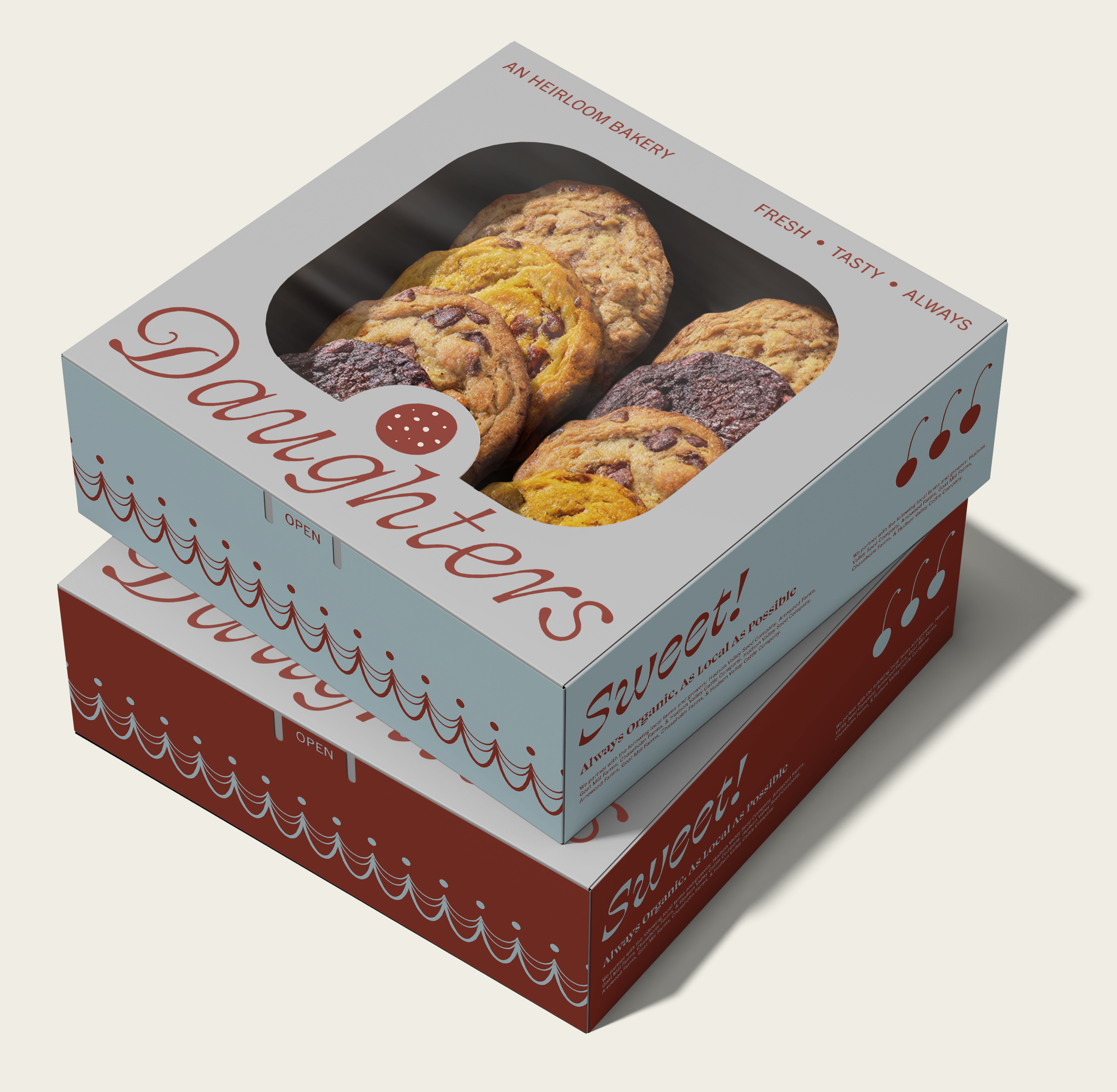
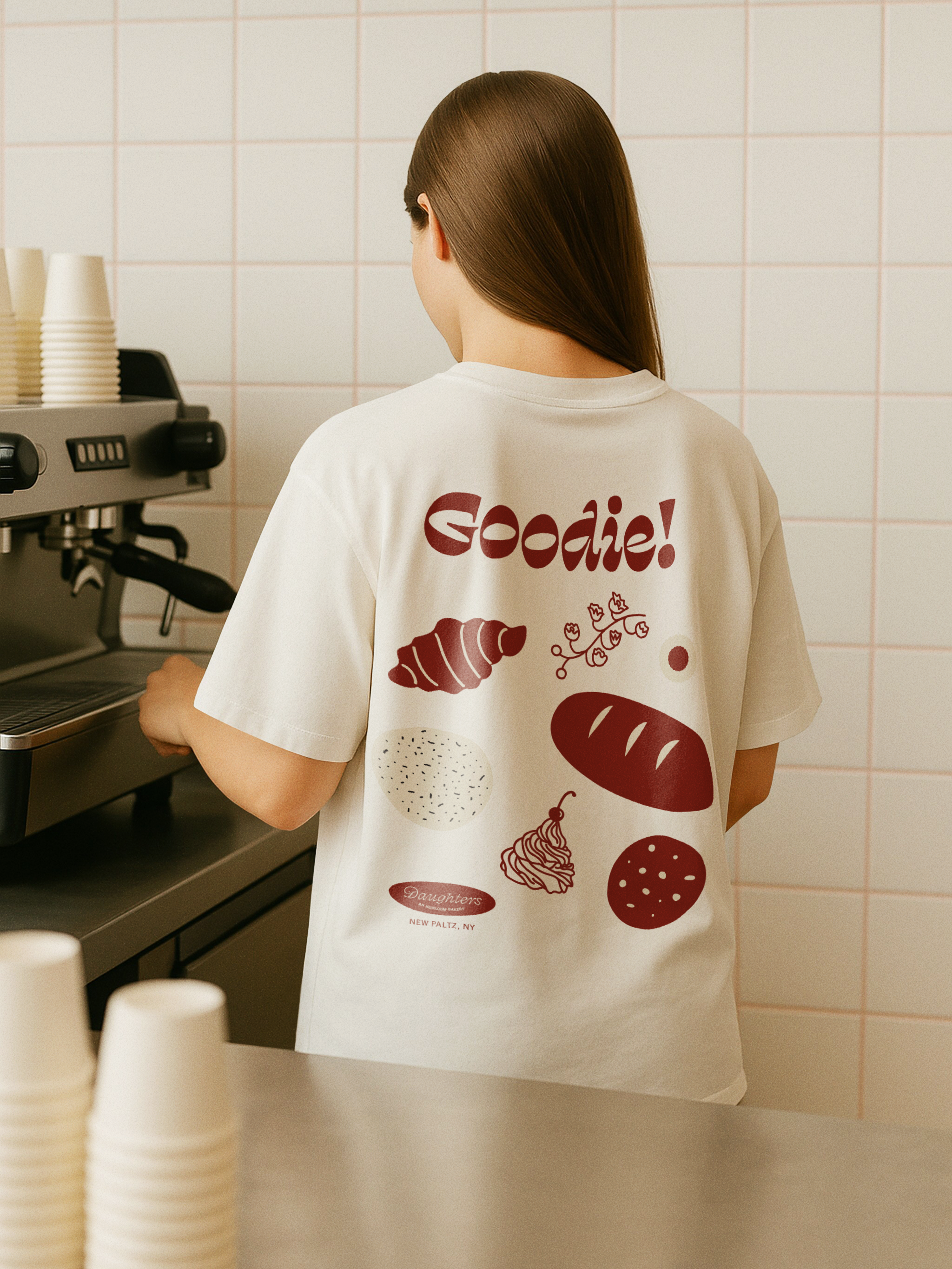
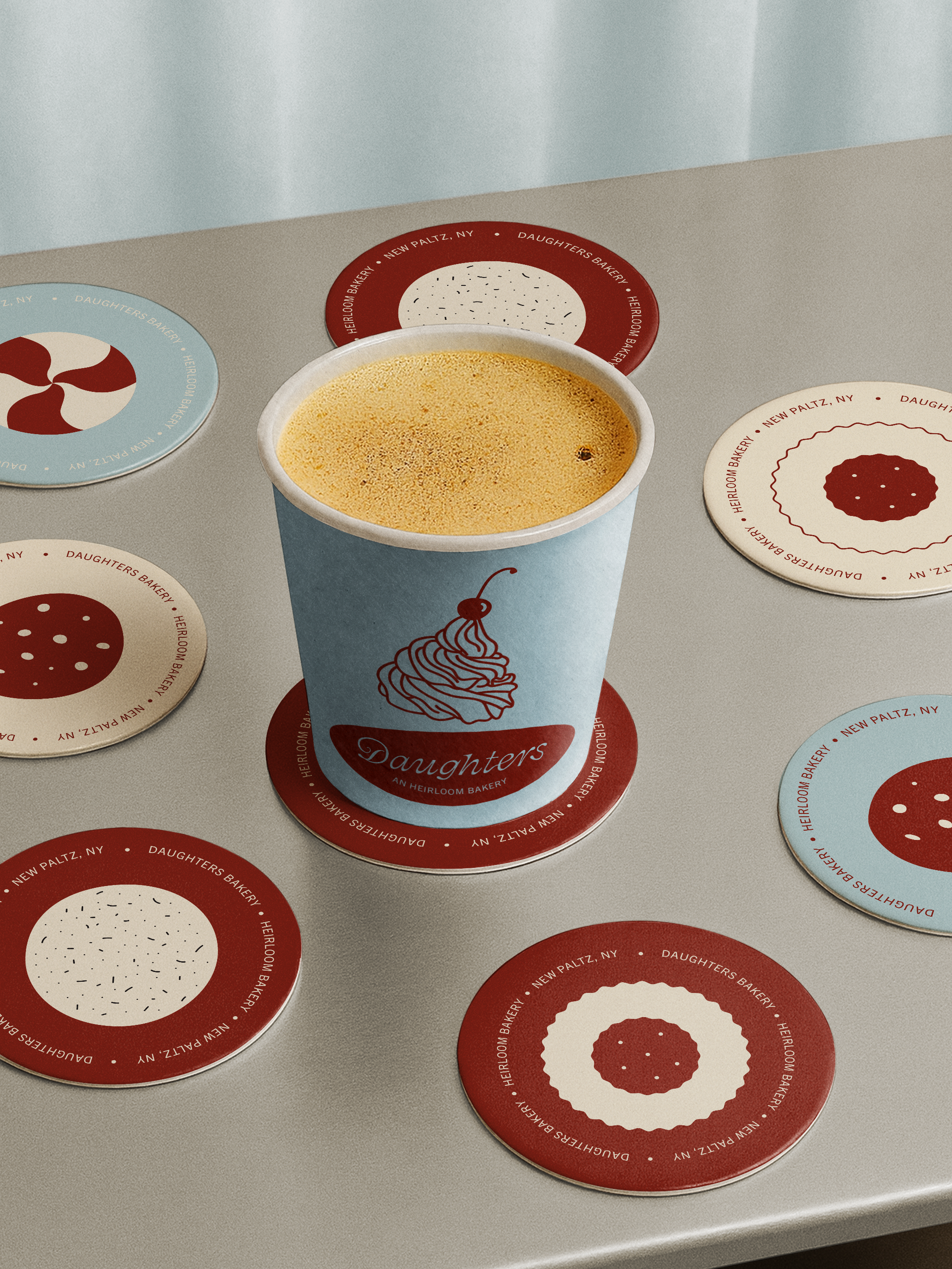
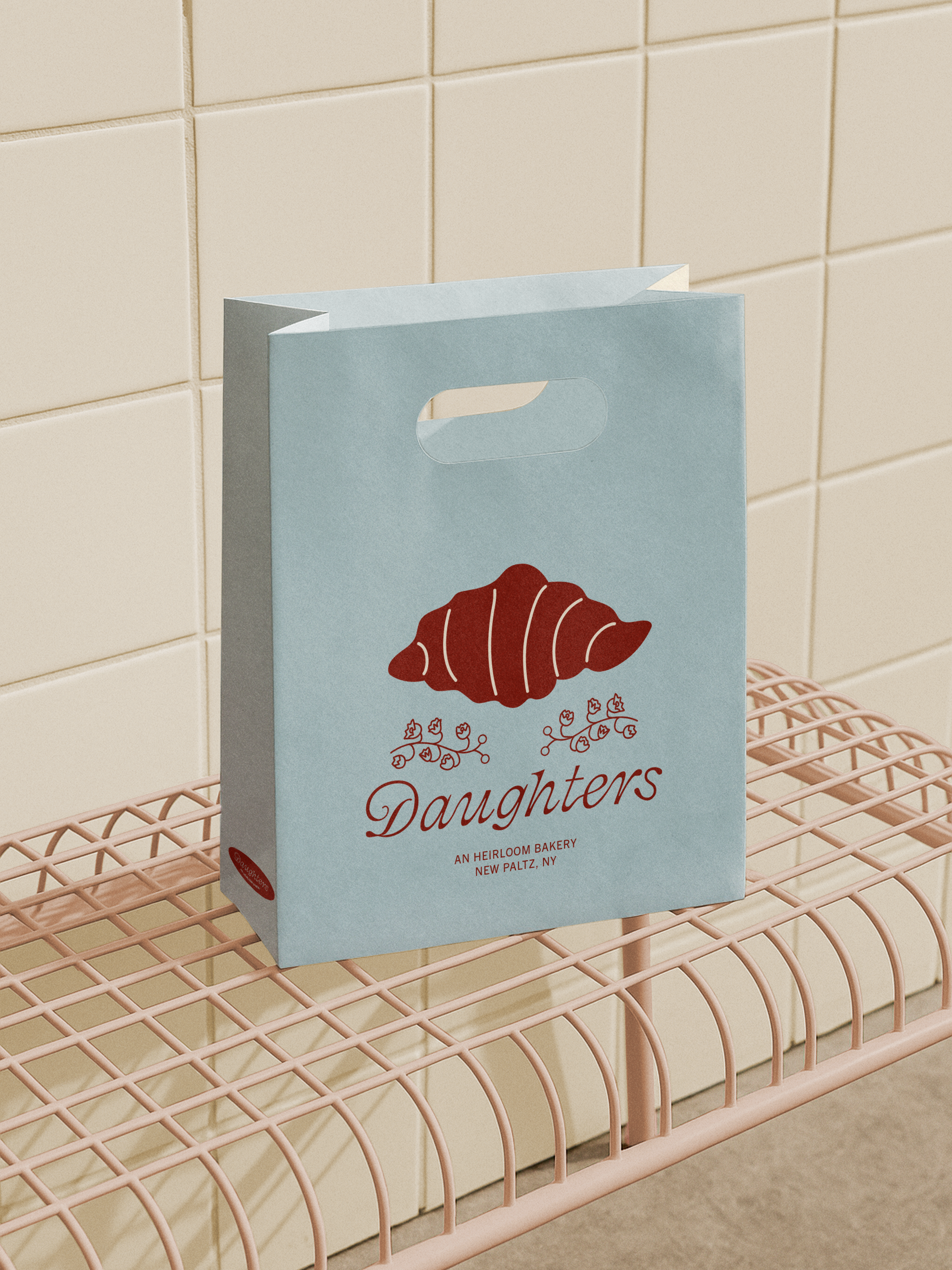
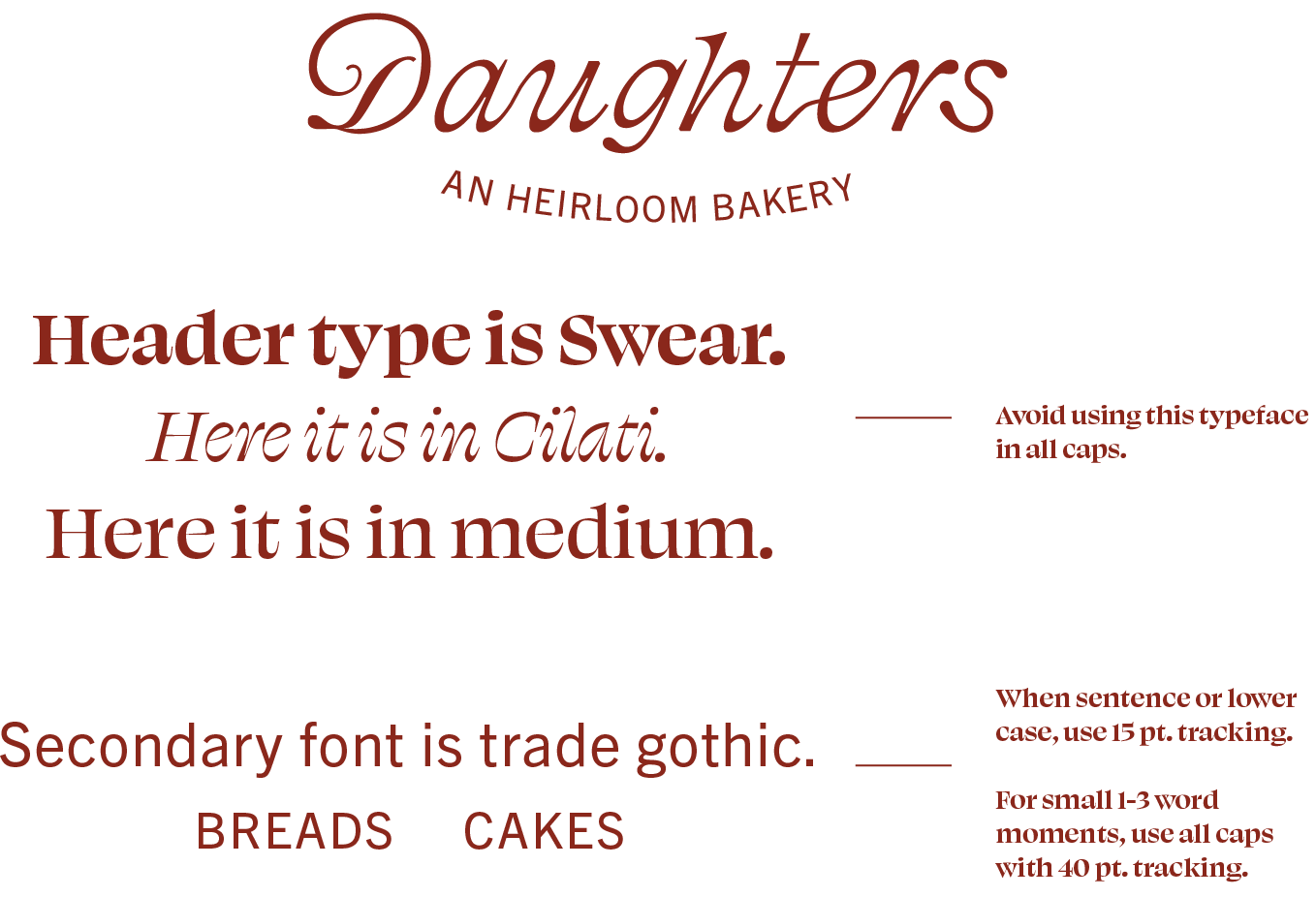
Brand IdentityThe brand identity for Daughters is warm, playful, and lived-in, built around custom typography I created alongside Swear and Trade Gothic. Because the concept centers on a second-generation bakery, I wanted the visuals to hold a gentle tension between playfulness and polish—reflecting both the fresh perspective of the younger generation and the history and craft they inherited from their father. The color palette, type system, illustrative elements, and photo treatment—warm color adjustments and a subtle grain for a film-like softness—come together to evoke nostalgia, a handmade sensibility, and an inviting, contemporary charm.
IllustrationThe illustrations for Daughters mix loose, childlike shapes with more delicate, feminine line work to reflect that same balance of playfulness and inherited craft. I created a small system of organic shapes—used both decoratively and as photo masks on the website—as well as a collection of food illustrations (and one flower) that appear throughout the branding. Together, they add a slightly imperfect charm that complements the more polished elements of the identity.